Front-End Development Trends

When HTML was first created, it was used to present some basic formatting. You could bold certain text, you could underline certain text, etc. Later, this activity became interactive with forms. Over time, these forms became more complicated and AJAX-based tools really unleashed the possibility of what could be possible in a browser. Then, paired with the additional complexity of security and the fact that accessibility has become extremely important and essential, our plain old HTML friend started clearly showing its age. As a result, HTML had to evolve.

These days, the vast majority of new applications are served through the browser. In fact, sit back and think about it: How many new products that have been launched in the last 10 years that you use on your laptop or desktop are not web applications?

Most of these websites have some common features. They all seem to have a header, paragraphs, navigation footers, etc. For the longest time, we’ve been trying to twist tags, like div and span, with some clever CSS to act like a header, paragraphs, navigation footers, etc. Semantic HTML changes that.

Semantic HTML is a way of writing HTML that focuses on the meaning of the content rather than just its presentation. It involves using HTML elements that describe the structure and purpose of the content, making it more readable, accessible, and maintainable. Semantic HTML uses elements that provide meaning to the structure of the web page.

Semantic HTML is a standard, as defined by the World Wide Web Consortium (W3C) and maintained by the WHATWG (Web Hypertext Application Technology Working Group). The HTML specification, which includes the definition of semantic HTML elements, is a standard document that outlines the syntax, structure, and semantics of HTML. This specification is maintained by the WHATWG and is widely adopted by web browsers and other HTML parsers.

The use of semantic HTML elements, such as <header>, <nav>, <main>, <section>, <article>, <aside>, <footer>, and others, is mandated by the HTML specification. These elements provide a standardized way to define the structure and meaning of web content, making it easier for browsers, search engines, and other tools to understand and interpret the content.

Although there may be some flexibility in how semantic HTML elements are used, the specification provides clear guidelines on their usage and meaning.

Semantic HTML in practice means that instead of writing…. this article is continued online. Click here to continue.
Unordered list without bullets

You can remove bullets by setting the list-style-type to none on the CSS for the parent element (typically a <ul>), for example:

ul {
  list-style-type: none;
}

You might also want to add padding: 0 and margin: 0 to that if you want to remove indentation as well.

See Listutorial for a great walkthrough of list formatting techniques.

For more info, continue reading on Stack Overflow

For more info on CSS box model, continue reading on W3 schools

Front End Plugins

This is a list of various front-end plugins and visual components.

TreeView

https://jonmiles.github.io/bootstrap-treeview/

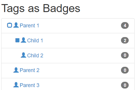
This plugin leverages the best of bootstrap framework and helps you display hierarchical tree structures using the JSON data set.

To read more, read this

Download from here

Bootstrap Material Select

Bootstrap Material Select is a form control that, after a click displays a collapsable list of multiple values which can be used in forms, menus or surveys.

For more info, read this

Bootstrap selectpicker class

Add the selectpicker class to your select elements to auto-initialize bootstrap-select.

<select class="selectpicker">
  <option>Mustard</option>
  <option>Ketchup</option>
  <option>Barbecue</option>
</select>

Via JavaScript

// To style only selects with the my-select class
$('.my-select').selectpicker();

or

// To style all selects
$('select').selectpicker();

If calling bootstrap-select via JavaScript, you will need to wrap your code in a .ready() block or place it at the bottom of the page (after the last instance of bootstrap-select).

Download from here

Using fieldset legend with bootstrap

Fieldsets are a set or collection of input fields in a form, used on a web page to collect user data. Legends are simply titles (also known as “captions”) that are added to the fieldsets to distinguish them from each other, thus improving UX.

“Fieldsets + Legends” are usually styled with a border that wraps the fieldset elements inside it, and the legend as a title on top of it.

<fieldset class="scheduler-border">
    <legend class="scheduler-border">Start Time</legend>
    <div class="control-group">
        <label class="control-label input-label" for="startTime">Start :</label>
        <div class="controls bootstrap-timepicker">
            <input type="text" class="datetime" id="startTime" name="startTime" placeholder="Start Time" />
            <i class="icon-time"></i>
        </div>
    </div>
</fieldset>

CSS is

fieldset.scheduler-border {
    border: 1px groove #ddd !important;
    padding: 0 1.4em 1.4em 1.4em !important;
    margin: 0 0 1.5em 0 !important;
    -webkit-box-shadow:  0px 0px 0px 0px #000;
            box-shadow:  0px 0px 0px 0px #000;
}

legend.scheduler-border {
   width: inherit; /* Or auto */
   padding: 0 10px; /* To give a bit of padding on the left and right */
   border-bottom: none;
   font-size: 16px;
}

This would be the output;

Reference

https://stackoverflow.com/questions/16852484/use-fieldset-legend-with-bootstrap

https://azmind.com/bootstrap-fieldset-legend/